Here’s something that might make you uncomfortable:
Right now, as you’re reading this, there’s a shop assistant somewhere in Manchester who can’t use your website because the navigation jumps around when they hover over it.
There’s a marketing director in Edinburgh who abandoned their online purchase because the checkout process had too many steps and no clear progress indicator.
There’s a university student in Bristol who gave up trying to book an appointment because the form validation errors appeared in tiny red text that their brain struggled to process.
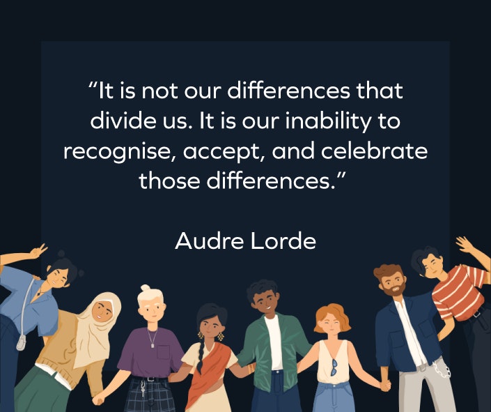
These people aren’t edge cases. They’re 15% of the UK population with neurodiversity.
So what is neurodiversity?
“Neurodiversity describes the population as a whole and recognises the diversity of different brains. Neurotypical describes most of the population the majority group that expresses themselves in ways that are seen as the societal “norm”. Neurodivergent describes the minority group that diverts neurologically from said “norm”.” Source: NHS.
Neurodiversity encompasses a wide range of neurological differences, including autism, ADHD, dyslexia, dyspraxia, Tourette’s syndrome, and many others. Each bringing unique perspectives, strengths, and ways of processing information.
The Real Problem Isn’t What You Think
Most of us are aware about the benefits and reasons behind adding alt text to images and bumping up colour contrast ratios. But real neurodiverse design goes deeper. It’s about understanding how different brains process information, make decisions, and navigate digital spaces.
Take ADHD, for instance. Someone with ADHD might:
- Get distracted by auto-playing videos
- Struggle with walls of text
- Need clear visual hierarchies to stay focused
- Benefit from progress indicators and completion states
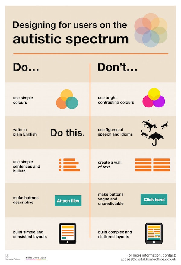
Or consider autism. An autistic user might:
- Prefer predictable navigation patterns
- Benefit from literal, clear language over clever but unclear copy
- Can find unexpected pop-ups distressing
- Require consistent visual design throughout the site
The Four Pillars of Neurodiverse Design
Predictability Over Surprise
Consider that clever hover effects and surprise animations might be delightful for neurotypical users. For neurodivergent users, they can be barriers.
Keep navigation consistent. Put things where people expect them. If your logo doesn’t link to the homepage, you’ve already lost some of your neurodivergent audience.
Choice Over Force
Auto-playing videos, timed content, infinite scroll; these features remove user control.
Give people the power to pause, reduce motion, or navigate at their own pace. It’s not about dumbing down your design. It’s about respecting your users’ agency.
Clarity Over Confusion
That pun in your headline? That abstract icon that looks like a butterfly but represents “transformation”? That call-to-action button labelled “Let’s Dance”? They’re not always clear to neurodiverse users.
Instead consider using clear, literal language. Make your icons obviously representative. Write button text that describes exactly what happens when you click it.
Support Over Stress
Error messages that say “Something went wrong” help nobody. Progress indicators, clear instructions, and helpful feedback support everyone — but they’re essential for neurodivergent users.
Think of your website as a helpful guide, not a puzzle to solve.
Simple fixes to remember
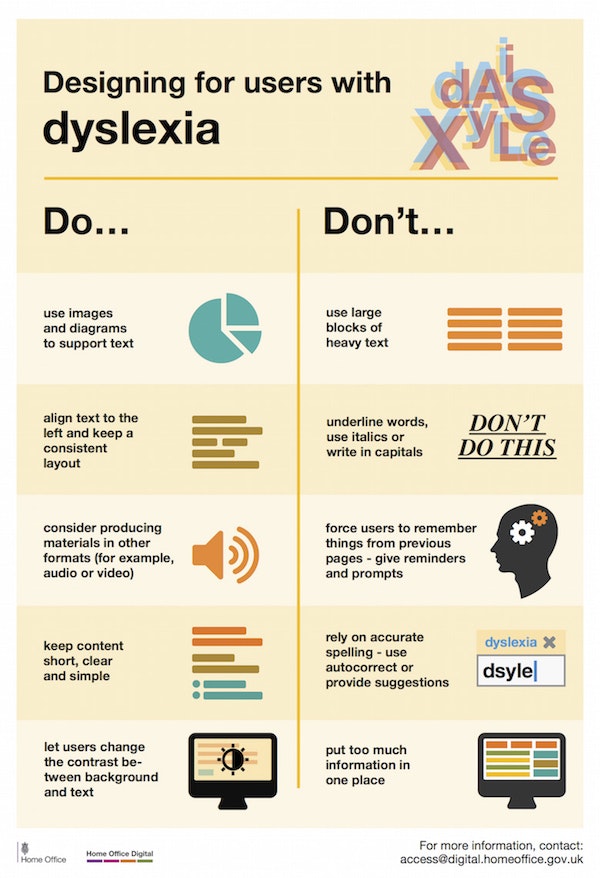
Typography matters more than you think
Dyslexic users read sans-serif fonts more easily. Adequate line spacing prevents text from swimming together. Proper colour contrast isn’t just about compliance, it’s about ease of reading.
White space
White space is processing space and cramped layouts create cognitive overload. Give elements room to breathe, and you give brains room to process.
Consistency
Consistent patterns create mental shortcuts. When your contact forms all work the same way, users don’t have to relearn your interface on every page.
Moving Forward Together
Designing for neurodiversity isn’t about adding extra features for some users. It’s about recognising that great design works for everyone.
Every project is an opportunity to create something that truly works for all users, something that we keep in mind for every project we work on. We’ve found that the most successful digital experiences don’t just accommodate different ways of thinking; they’re built with them in mind from the start.
Don’t know where to start with your new project? Talk to us for help.


