Optimising a website is often a delicate balancing act. If speed were the only goal, the “ideal” solution would be a bare-bones HTML file with no styling and no images — something closer to a 1990s text adventure than a modern website. In reality, performance is always about trade-offs: we want to make sites faster, but not at the expense of the experience.
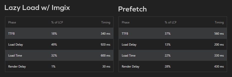
This trade-off is something I encountered while using Google’s Lighthouse tool to audit and improve performance for Design Week. The most notable performance increase could be achieved by prefetching the larger images within the lead stories. We previously lazy loaded our images in combination with Imgix, which allows responsive sizing and optimisation across devices. The need to find balance between speed and quality came into sharper focus.
Let’s Prefetch
Prefetching works quite simply by adding the rel=”prefetch” attribute to the image tag. This instructs the browser to pre-emptively fetch the resource in advance. This makes the page load feel quicker because that first, most visible element is ready and waiting. By using this method I was able to reduce the Largest Contentful Paint load by 360ms. Shaving off small amounts like this can add up quickly, and it’s by no means a trivial speed increase.
However, it’s not an overly dramatic reduction either. This wouldn’t matter if it was “free”, but unfortunately it comes with some drawbacks.
Prefetched images are typically served at a fixed resolution, which can create waste or compromise quality. A high-resolution file might look fantastic on a desktop but chew up unnecessary bandwidth on a mobile, while a lower-resolution version may appear soft and blurry on larger screens. This would be manageable if we had a static hero image to manage, using responsive design methodology. Design Week, however, has new posts added everyday to its lead stories section and the overhead to manage images for all of those posts would be impractical.
Back to Lazy Loading?
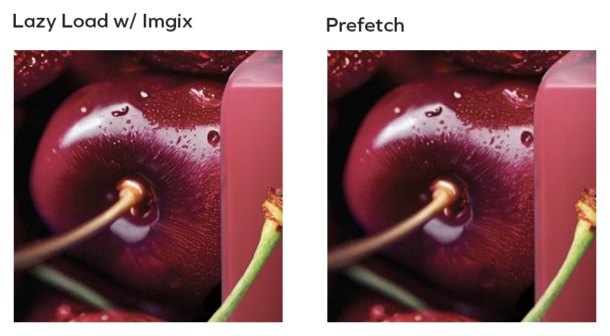
Lazy loading takes a different approach: the hero image isn’t requested until it’s actually needed in the viewport. This keeps the initial page weight down and, when paired with Imgix, allows the browser to fetch the most appropriate version for the device. A mobile can receive a smaller, efficient file, while a desktop gets something sharper. Quality can be adjusted depending on network conditions.
The flexibility here is considerable. Developers can not only control resolution but also provide alternative crops, resizes or even entirely different compositions for mobile and desktop.
The trade-off here is that there may be a slight pause before the hero image appears, particularly on slower connections. In some cases it can also cause layout shifts as the content is loaded in. This makes it important to reserve space by setting dimensions or aspect ratios, and to take more care when configuring the site’s layouts.
Which is best then?
Neither. Like most things in web development, there’s rarely a one-size-fits-all solution. Context is vital, one has to ask the question: what’s the business case behind all of this? Design Week is a design focused magazine, as surprising as that may seem. If it doesn’t have sharp, striking imagery then it’s not doing its job. So whilst that 360ms may seem tempting it ultimately wasn’t worth the reduction in image quality that it’d cost us. Performance and efficiency are always going to be important to the success of a site, but they’re far from the only metric that matters.


