Relax. I’ll explain.
When we first discussed updating our website, I felt excited and terrified at the same time. Standfirst has built its reputation as a reliable software development partner.
We’re the team clients call when their site crashes at 2 am or when they need to handle massive traffic without breaking the bank. We’re not flashy. We don’t chase trends. We often fix problems without customers even realising.
This created our main challenge: How do you show “quietly confident tech skills” in a memorable way?
When reality bites
“We were hiding our light under a bushel,” someone said in an early meeting.
First, we had to admit some hard facts about our old site. Despite 29 years of building award-winning platforms for clients like The Telegraph and New Statesman, our own website made it look like we were hiding what we could do.
I spent weeks talking to people about our site. The pattern was clear. Visitors could see we built websites, but they couldn’t work out how we were different from any other web agency. They couldn’t quickly understand why our approach mattered or find information about their specific needs.
The juggling act
One big insight came when I mapped out our core client personas. We’re having five different conversations at once:
- CTOs want to know about our technical setup and security
- Publishers care about traffic handling and content management
- Marketing Directors focus on performance and integrations
- CEOs want to know about business continuity and ROI
- Project Managers need clear processes and communication
Most websites force you to pick one main audience. That wasn’t realistic for us. Instead, we needed to adapt to different users while keeping everything consistent.
Pulling back the curtain
“Customers need to know we regularly maintain our customers’ sites, not just when they report a support ticket.”
The solution was creating service offerings based on outcomes, not just another list of services. Instead of listing “Customer Support,” we explain “Digital Reliability.” This connects technical capability to a business benefit immediately.
We explain this simply, using a clear illustration of a mechanic fixing a car. Everyone gets the value of a well-serviced car, and not having to worry about breakdowns. We use this analogy all the time when talking to customers, so it made sense to build on it. We applied this approach to explain other services too, making them feel concrete and relevant instead of abstract technical concepts.

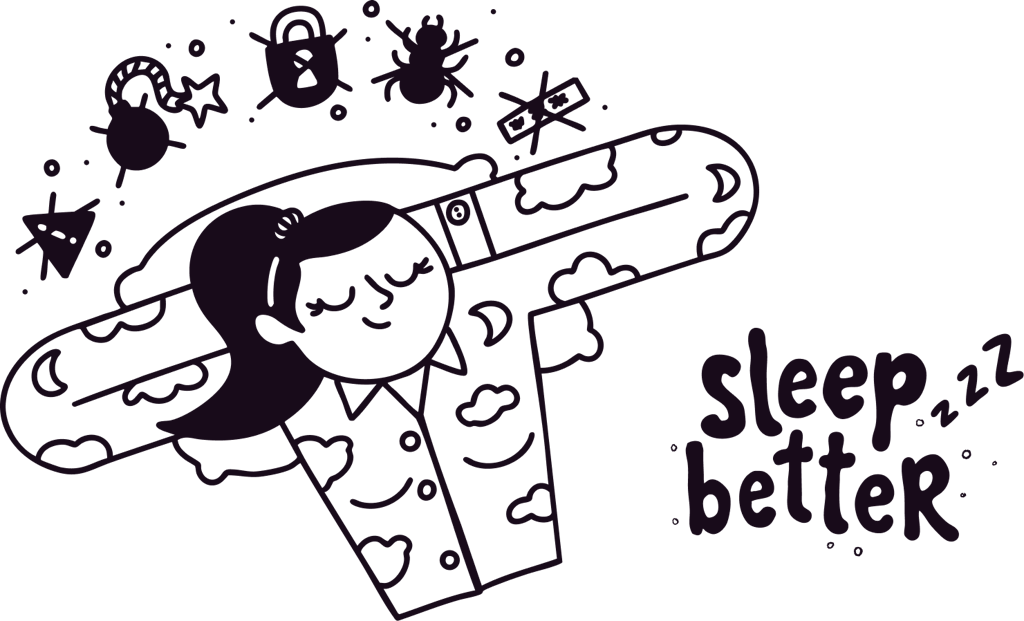
Sleep better
We introduced a company strapline: “Sleep better.” It captures what we’re really offering overall – peace of mind. When your website is in our hands, you don’t need to worry about crashes, traffic spikes breaking your site, or security breaches keeping you awake. We’ve got it covered. The strapline works because it’s not about the technical stuff we do – it’s about the feeling our clients get when they work with us. They can focus on running their business instead of worrying about whether their digital infrastructure will hold up. It’s a simple way to explain a complex value proposition.
Bringing stories to life
We worked with an illustrator to create a series of characters and scenarios that brought our new content to life. Instead of relying on stock photos or generic icons, we developed a cast of characters that could demonstrate different aspects of what we do. Each character represents a different service, but they all exist in the same visual universe. This gave us another dimension to the Standfirst brand and helped clients understand the scenarios we were describing, while also bringing a bit of fun and personality to the site.

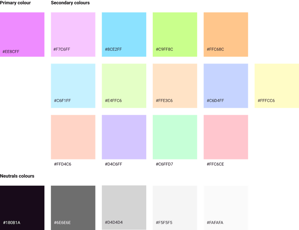
Colour as communication
Our old colour palette worked well, but we needed to expand it for the new illustrations depicting our services. We expanded carefully, testing combinations that felt cohesive but meaningfully different.
Walking the walk
Throughout the design, I kept asking: If we can’t build an engaging, high-performing website for ourselves, why should clients trust us with theirs?
This changed everything. Instead of designing a typical “about us” website, I started thinking of the site itself as a demo of our capabilities. Every interaction, every page load, every responsive breakpoint needed to show the kind of work we do for clients.
We included subtle performance indicators – page load times, server response data, and uptime stats. Not to boast, but as evidence of competence. The site becomes living proof, constantly showing the reliability and attention to detail we bring to client work. It also helps that we own Design Week, so we genuinely share many of our customers’ pain points.
Avoiding the kitchen sink
One unexpected challenge came from our genuine range of capabilities. Standfirst really does handle everything from emergency site rescues to complex paywall setups, from security audits to custom CMS development. But “we do everything” is terrible messaging. It suggests a lack of focus, not comprehensive expertise. The solution was to create a “How we work together” section that helps visitors find the right services for them. Instead of listing everything we do, we guide people to what they actually need. While every client is different, we’ve noticed common patterns, so we built clear starting points for conversations. This way, potential clients can easily see which of our services match their specific problems.
Authority vs approachability
The trickiest balance was using language that shows technical expertise while staying approachable. I wanted to try and avoid “jargon monoxide” at all costs.
Standfirst’s advantage often lies in being the expert team that can explain complex technical decisions in plain English to the customer. But communicating expertise without overwhelming non-technical decision-makers took many content edits.
We used layered content. Headlines and initial explanations use accessible business language, with more technical detail available for those who want it. Interactive elements let visitors choose their own depth. Visual hierarchy is crucial here – using typography, whitespace, and colour to make technical content feel organised and navigable, not dry and intimidating.
Built to last
Perhaps the most important decision was future-proofing the system. Standfirst continues to expand into new areas, including AI integration, advanced security, and next-generation publishing platforms. Rather than rebuilding the entire site every time we add something new, when we develop a new capability, we can slot it into the existing structure without disrupting what’s already working.
Each service gets its own dedicated space, but everything shares the same tools and visual language. Think of it like adding a new department to a building that was designed with expansion in mind; you’re not knocking down walls or rewiring everything, just fitting the new team into a space that’s ready for them.
This means we can announce major new services or make small updates with equal ease, and clients always receive the same consistent experience, regardless of whether it’s new or has been there for years.
The human element
Throughout the project, I kept thinking: behind all our technical capability are real people solving real problems for real businesses.
The most sophisticated hosting infrastructure means nothing if clients don’t trust the people managing it.
The final design balances technical demonstrations with clear indicators of human expertise and availability. Team credentials are prominent for trust-building, not ego. Getting in touch is never more than one click away because we added a persistent call to action in the header. Support is much easier to find in the footer and the secondary menu, with how to submit a support request clearly explained in a form.
A living system
This refresh isn’t finished – it’s a foundation for better client communication as Standfirst keeps evolving. The modular design system, flexible content architecture, and scalable visual approach provide tools for ongoing development, not a static solution.
Most importantly, the site now represents what we actually do better: solve complex technical challenges through clear thinking, proven expertise, and genuine commitment to client success. It took months of design work to make that simplicity visible, but it was worth the effort.


